Oct 29, 2026Chain Operations
Color Psychology on the Plate: What the Palette Does to Appetite
Color eats first. The palette science of the table — appetite colors, suppression effects and the brand palette's honest translation to ware.

Color eats first: the guest's appetite responds to the palette before the flavor lands. The plate's color changes how food tastes — or at least, how much of it gets eaten. The psychology of the table is a design tool: appetite colors, suppression effects, and the honest translation of the brand palette to ware. This guide reads the plate through color science.
The Appetite Palette
The colors that feed: the warm spectrum's appetite effect — the reds and oranges that stimulate (the classic fast-food logic, not accident), the earth tones that comfort (the browns and creams that read as homemade), and the whites that present (the clean stage that lets the food's colors speak). The palette's discipline: matched to the menu's intent — the appetite-forward concepts lean warm, the fine-dining leans neutral, the health-positioned leans green-adjacent. The appetite palette is the menu's silent marketing: chosen per concept, not per trend.
The Suppression Effects
The colors that turn plates down: the blue's famous appetite suppression (the color rare in food, hence the brain's read), the over-bright's alarm (the saturated plates that compete with the food), and the mismatch's confusion (the plate color that fights the dish's colors). The effects' discipline: used deliberately (the blue accent where the concept wants portion modesty — the health tier's honest tool), and avoided where appetite is the business (the volume restaurant's blue plates are a strategy error). The suppression effects are the palette's reverse gear: knowing what slows the table.
The Contrast Mathematics
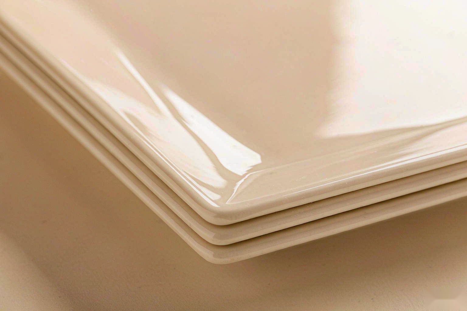
Food visibility is contrast math: the plate-to-food contrast that defines the read — the pale plate under dark food (the steak's drama), the dark plate under bright food (the salad's pop), and the low-contrast trap (the cream sauce on the cream plate — the dish that disappears). The math's discipline: the menu's palette mapped against the fleet's (each dish's color tested against its vessel), and the contrast's dignity (the drama that serves the food, not the photographer only). The contrast mathematics is the plate's optical contract: the food reads, or it doesn't.
The Brand Palette's Translation
The brand's colors want the table: the translation's rules — the palette's food-safe rendition (the glaze's color science: the brand red that survives firing), the proportion's honesty (the accent layer vs the full-plate color — the loud brand color as the rim, not the field), and the drift's discipline (the batch-to-batch color consistency that the brand demands). The translation's trap: the brand color that fights every dish (the saturated full-color plate that starves the food's own palette). The translation is design diplomacy: the brand present, the food leading.
The Cultural Palette
Color reads by culture: the palette's cultural layer — the white's different weights (purity here, mourning there), the red's readings (celebration across much of Asia, danger's edge elsewhere), the gold's registers (luxury here, excess there). The layer's discipline: the market's palette research (the multi-market chain's color audit per region), and the localization's line (the core palette's global consistency with the cultural accents' local respect). The cultural palette is the color psychology's geography: the color that travels is the color that was checked.
The Texture-Color Interaction
Color reads through texture: the interaction — the matte's muted depth (the color softened, the food foregrounded), the gloss's amplification (the color brightened, the highlights' noise), and the reactive glaze's variation (the color that lives in ranges, not points). The interaction's discipline: the palette specified with its finish (the "terracotta matte" is a different color than "terracotta gloss"), and the sample's lighting (the color under store light, not showroom light). The texture-color interaction is the palette's third dimension: the finish is part of the color.
The Seasonal Palette
The palette breathes with the menu: the seasonal layer — the spring's pale accents, the autumn's ambers, the winter's deeps (the accent layer's rotation on the constant core). The layer's discipline: the core's stability (the brand's base palette does not chase seasons), and the accent's restraint (the seasonal color in the small vessels and the garnish layer, not the fleet). The seasonal palette is the table's freshness signal: the menu's calendar, colored.
The Testing Protocol
Color decisions need testing: the protocol — the menu's dishes plated on the candidate palettes (the real food, the real light), the guest's read (the perception panels where the stakes justify), and the photography's check (the palette's camera behavior — the shots that will carry the brand). The protocol's discipline: decided with data under store conditions, and reviewed when the menu changes (the palette that served the old menu may fight the new). The testing protocol is the color psychology's lab: the plate judged where it will live.
Frequently Asked Questions
What is the appetite palette? The warm spectrum (reds, oranges) stimulates; earth tones comfort; whites present. Matched to the concept's intent — appetite-forward leans warm, fine dining leans neutral.
How does suppression work? Blue's appetite suppression is real and useful where portion modesty is the goal (the health tier's honest tool) — and a strategy error where covers are the business.
What is the contrast mathematics? The plate-to-food contrast defines visibility: pale under dark, dark under bright, and the low-contrast trap (cream on cream) that makes dishes disappear.
How does the brand palette translate to ware? Food-safe renditions, proportion honesty (brand color as rim, not field), and batch consistency — the brand present while the food leads.
Why test color under store light? Color reads through finish and lighting: the showroom lie is real — the palette decided with the menu's dishes under the store's light, or not decided at all.