
Oct 27, 2026Chain Operations
Melamine Tableware Collections: A Visual Tour for Chain Restaurant Buyers
Twelve scenes from our melamine program — collections, portion formats, serving pieces and surface details — with what to look for in each when you specify for multi-store service.
Melamine Tableware Collections: A Visual Tour for Chain Restaurant Buyers
Specifications describe tableware; photographs argue about it. When a chain approves a melamine program, the decision usually happens over images — and the images that matter are not glamour shots but working views: how the plates stack, how the finishes sit next to each other, how the portions land in a compartment tray.
This visual tour walks through our melamine collections scene by scene, with a note on what each view tells a buyer. Use it as a companion to the written specification, not a replacement for samples.
The Collection at a Glance
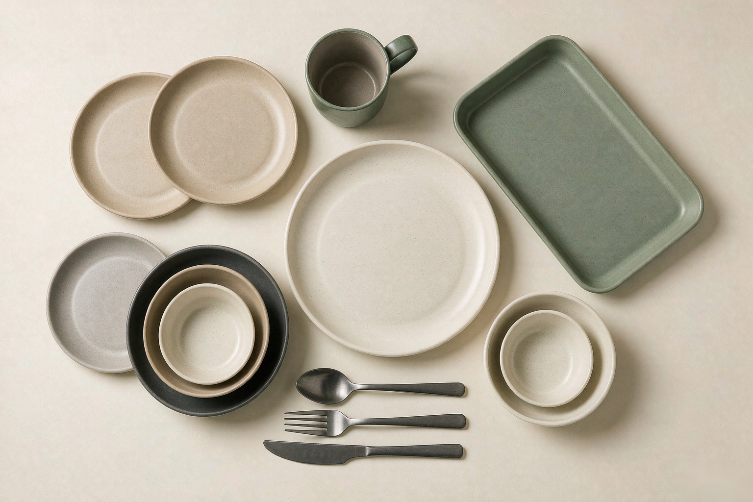
Start with the whole family in one frame. The overhead view is the single most useful photo in any program file: it shows relative sizes, the spread of finishes, and how the pieces read together as a set.
The styled still life below is how the collection presents in a dining context — warm light, mixed heights, the matte surfaces doing the quiet work. A collection that only photographs well from above but not in context is a photography problem; one that works in both views is a design system.

Plates: Reading Finish and Stack Together
A row of plates is a finish ladder. In the five-plate line-up, note how each surface holds light differently — the matte tones read calm and contemporary; glossier centers read more traditional. Chains usually standardize on one finish and keep the others as accent pieces for seasonal menus.

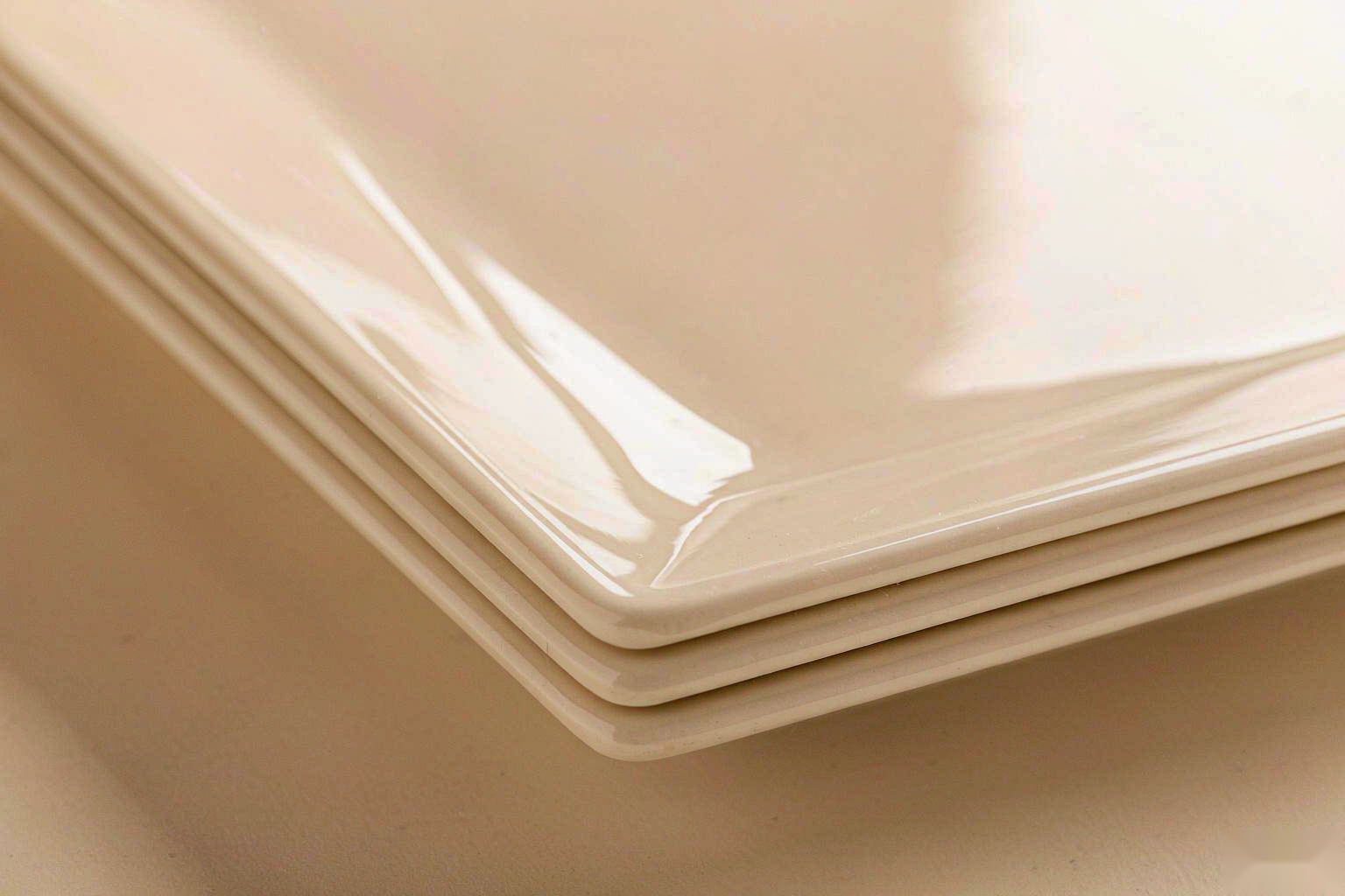
The stack view answers a dish-room question: how tall does a service stack of plates sit, and do the rims clear each other. Deep-rim stacking protects glaze surfaces from scratching and determines how many pieces fit a shelf, a rack, and a pass window.

Portion Control: The Compartment Format
Compartment plates are portion discipline made physical. Three sections mapped to a menu — protein, staple, side — keep plating consistent across every store and every shift, which is exactly what a chain brand needs from the format. Look at the divider height in the scene below: walls tall enough to keep sauces apart survive real service.

Serving: The Rectangular Tray
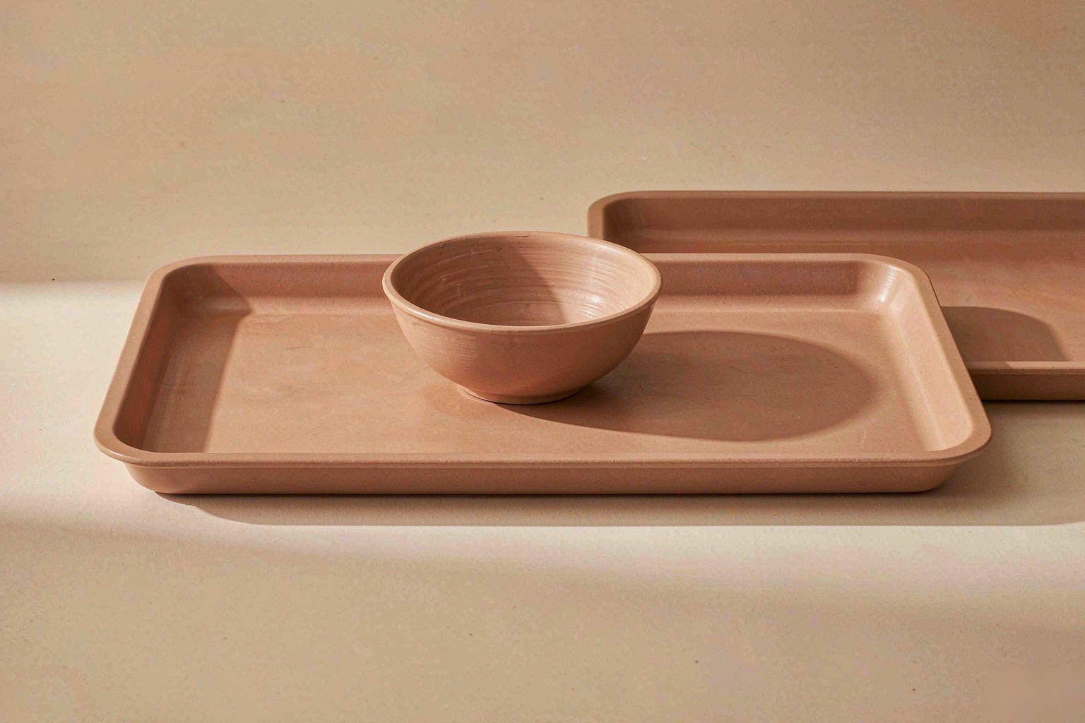
Rectangular trays are the workhorses of shareable menus and pass-through service. The clean rectangular silhouette below carries food from kitchen to table without ceremony — and in neutral tones it photographs under any menu styling without clashing.
Bowls: The Nested Family
Nesting is a logistics feature disguised as a product photo. Bowls that nest compactly reduce shipping volume, shelf footprint, and storage clutter — the three quiet costs of every bowl program. The nested view is the one to compare across suppliers.

Mugs and Cups: Pairs in Service
Mugs live in guests' hands, so weight, handle geometry and wall thickness matter more than any other dimension. The paired view shows proportion: enough wall to insulate, enough handle to grip with two fingers, stable enough foot to survive table traffic.

Cutlery: The Matte Set
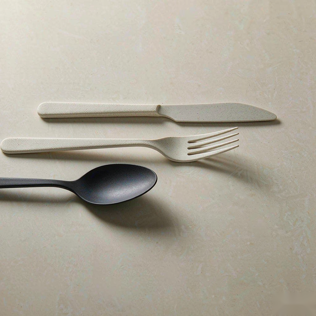
Melamine-handled cutlery keeps the casual register of the collection while the working ends stay functional. The matte finish in the set below matches the plate family — finish coherence across categories is what separates a collection from an assortment.
Color Story: Single Pieces as Accents
Every collection needs a quiet hero color. The terracotta single plate below shows how one accent tone, used sparingly, warms an otherwise neutral table. When specifying custom colors, evaluate a single piece first — batch color standards come later, against sealed references.

Surface Behavior: The Close-Ups
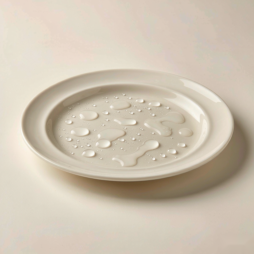
Two macro views tell you what the material actually does in service. The rim detail shows edge quality — clean transitions, uniform walls, no flash lines from molding. Edges are where melamine either proves its grade or shows it.
And the water-beading shot captures the surface behavior after rinse: droplets standing on the matte body rather than sheeting in. Surface behavior like this is what dish-room longevity looks like before it happens.
How to Use This Tour
Work through the scenes with your specification open. The collection views set the design language; the functional views — stack, nest, compartment, tray — carry the operational decisions; the macro views hold the material quality questions. When the scenes and the written specification agree, approve. When they disagree, the photograph wins — order samples and check again.
Visual evaluation is the fastest filter in a sourcing process. It is not the last word: samples in hand, batch records, and per-batch verification remain the standard of proof. But a tour like this one, compared collection by collection, shortlists suppliers faster than any spec sheet.
Frequently Asked Questions
Do these scenes represent every production batch? They represent the design standard. Production batches are verified against sealed references — color, dimensions and surface — as part of routine inspection.
Can we mix these formats across concepts in our group? Yes — the collection logic is designed for it. Groups running multiple concepts commonly share the core formats and differentiate through accent pieces and custom colors.
What should we request after reviewing images? Physical samples of the shortlisted pieces, the measured absorption and heat-resistance data for the body, and per-SKU food-contact documentation.
How do custom colors work against these standard tones? Standard tones ship as cataloged; custom colors run against a sealed reference with batch-level color comparison before release.
Are the scenes styled with any props we cannot order? The tableware in every scene is from the program; staging surfaces and light are photography only.